
🗒️ BRIEF(日本語のバージョンこちら👉)
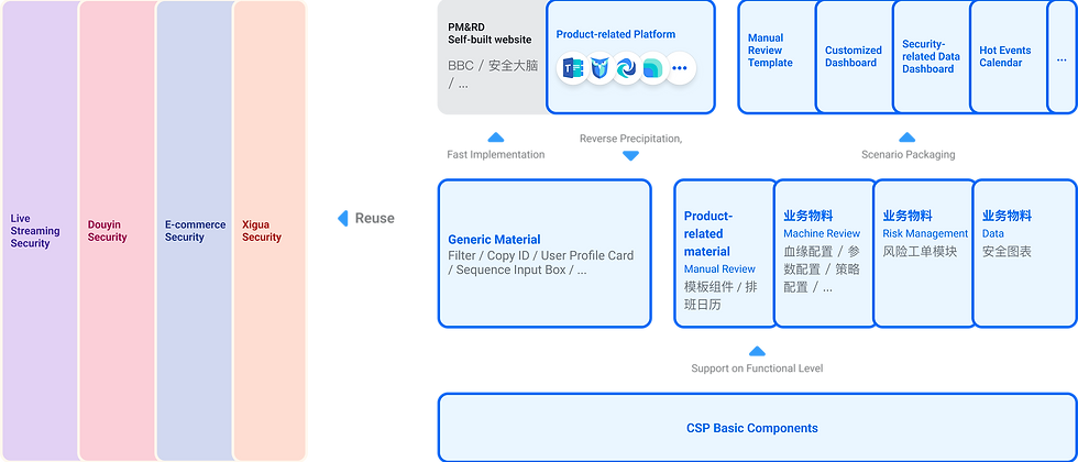
The CSP design component library is a branch of the native component library for Semi Design. It is a subcomponent library derived by our CSP team for the content security business background.
🎒 SKILLS
Component library construction, team collaboration, business background analysis
⏰ TIMELINE
2021.3 - 2022.3
🏃🏻♀️ PROCESS
1️⃣ Discover
-
Gather painpoints from designers and FE
-
Research on other related design systems
-
Prioritize design and development schedules
2️⃣ Define & Design
-
Refer to the design of previous designers to find out the design background and business background for consistency and unification
-
Feasibility of directly modifying Semi docking with native component library Semi
3️⃣ Carry out
-
Continuous development
-
Experiment with new platforms
-
Recommend product managers to try it out directly
🤔 Difference between CSP and Semi
Semi

CSP
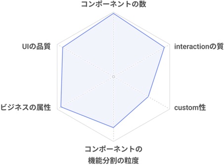
CSP is a branch of business components derived from semi. Its number of components, UI quality, and interaction quality are consistent with semi, thereby reducing the workload of frontend development. Since semi is widely used by many design teams, it possesses strong customization capabilities. We have endowed CSP with business attributes, and internally, we have standardized business backgrounds and design methods, making it widely adopted. Due to its involvement in a large number of detailed user usage habits and features, CSP's design precision is also higher. We will also empower semi in return, providing them with better design solutions.
👁 Core Value

Serve for Content-compact, Complex and Deep-level Review Scenarios

More Detailed Business Scenarios; Simplify Complicated Layouts, Gather Unused Dimensions and Styles According to Compact Review Layouts
Serve for Platform-type Products - Improve User Efficiency, Customize Interactions Based on Business Requirements
🖌 Design Thinking

Atom
色
フォント
icon
丸い角
shadow
...

Molecule
Input
Select
Checkbox/radio
Upload
Datepicker
...

Orginazation
Dropdown
Navigation
List
Card
Popover/tooltip
...
Modular
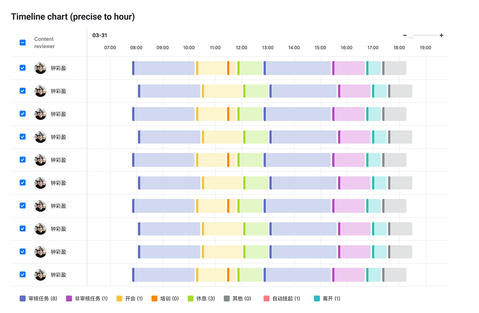
Filter
Diff display
Bulk operation
...
Page
Form
Data dashboard
Task detail page
...
🌲 Components Library カタログ
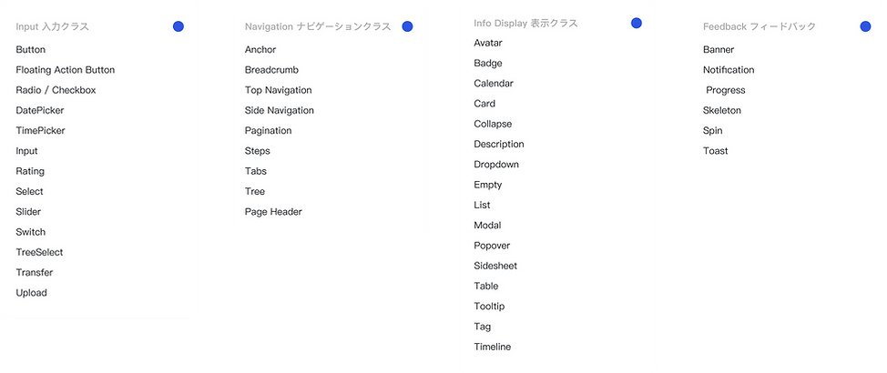
🔵 Font

🎨 Color

©️ Icon
Button
Interaction Styles
Button states include default, hover, pressed, persistent state, and disabled. The interactions for different types of buttons are shown in the following figure.

Visual Styles
There are four types of buttons (regular and small): primary, secondary, tertiary, and borderless. Each type corresponds to a different level of emphasis, and different usage scenarios. In addition, there are also backgroundless buttons, block-level buttons, link buttons, and split buttons. The regular button height is 32px, but in some scenarios where space is limited, a small size (24px) button can be used.

Navigation
Side navigation

Top navigation

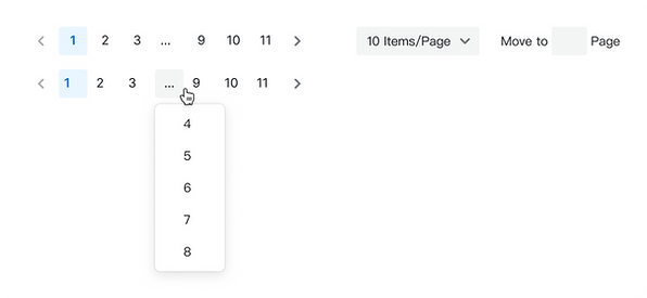
Pagination
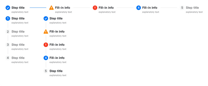
Steps
Data Input
Input

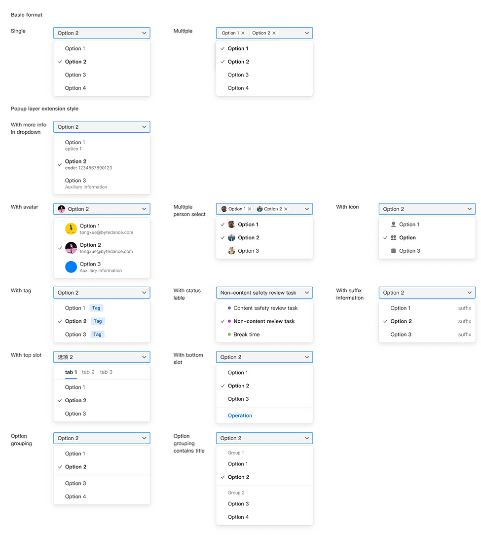
Select
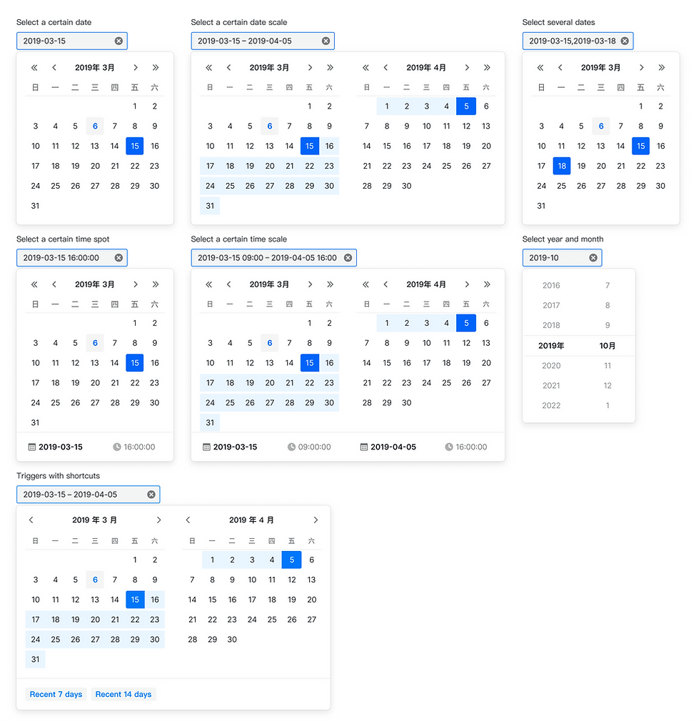
Date picker
Data Display
Input
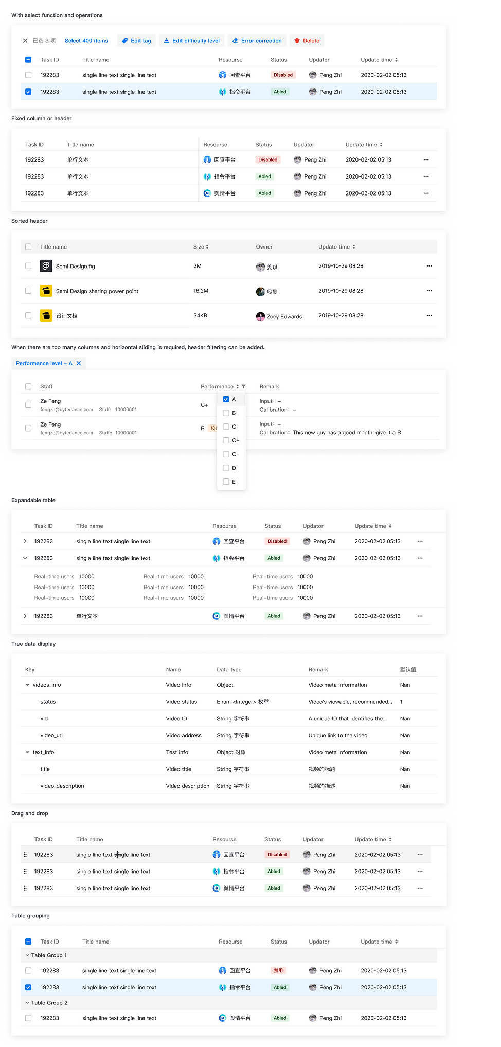


List

Information Display
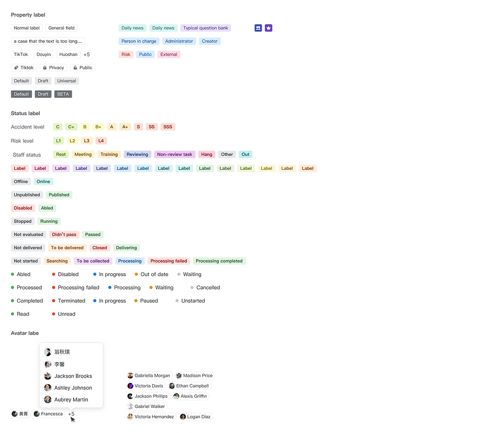
Tag
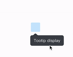
Tooltip
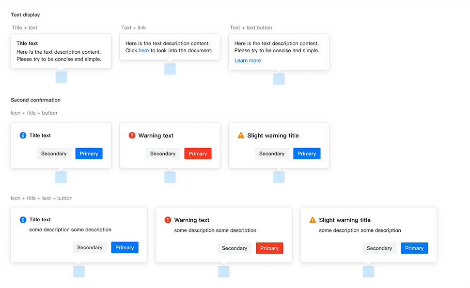
Popover
Data Visualization

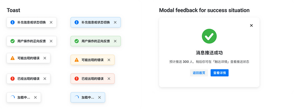
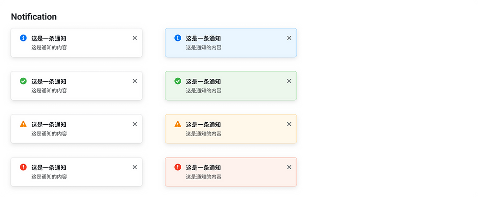
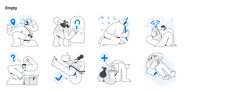
Feedback



Product-related material
