
🎨Introduce Design Tokens


Based on the Wework Global Design Guideline and Material 3, I led the creation of a customized design system tailored for the Japanese market.
It maintains global consistency while being locally optimized for Japanese user habits and aesthetic preferences—achieving a design that is both unified and culturally relevant.
🌏 Blending Global Standards: Inherits global brand DNA and Material Design language
🇯🇵 Localized Adaptation: Adjusted typography, color brightness, and interface rhythm to suit Japan
🧱 Component System: Highly reusable, easy to maintain, supporting multiple product lines
🤝 Team Collaboration Boost: Streamlined design-dev handoff, improving delivery speed and consistency
This was more than system building—it was a cross-cultural design conversation.
🤝 Collaboration with the team
Since we are a small team, I cannot expect everything happens matching our original schedule.
So it's very important to do the synchronization with the team members, and make smart designer's decisions.
-
I kept holding bi-weekly meeting after finishing the design system, in order to introduce components and hifi design progress.
-
I maintained a google spreadsheet to keep track on developing progress
-
After moving to hifi stage, I have a much clearer mind to decide the priority of component stucture.


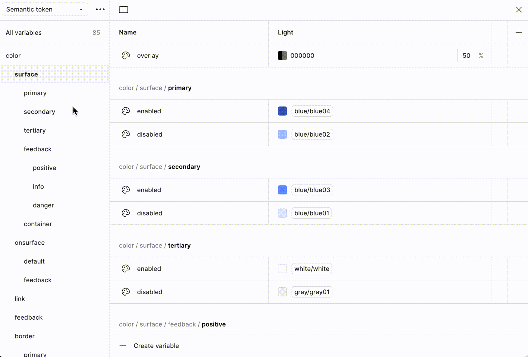
🎨 Tokens Overview

BEFORE UX
AFTER UX

BEFORE UX
AFTER UX

BEFORE UX

AFTER UX
BEFORE UX
AFTER UX

BEFORE UX
AFTER UX


BEFORE UX
AFTER UX
BEFORE UX
AFTER UX

BEFORE UX
AFTER UX

🧱 Components
BEFORE UX
AFTER UX
🫸 Loading
🌬 Empty States
❌ Error Handling
ENSURE BETTER EXPERIENCE
Better Empty States:
Based on user survey, some of the users are expecting some nearby location recommendations if the searching result is empty, in this sense, in order to provide them with better UX, we are trying to give them some other choices for more flexibility.


About Page Loading:
Based on research, here are some thoughts about loading time handling:
-
1s - Users perceive the response as fast
-
1~2s - Acceptable to users
-
2~5s - The user perceives it as slow, needs to have loading animation
-
need to start considering dynamic effects
-
-
5~10s - The user will feel irritable and try to refresh the page
-
add loop loading page
-
-
More than 10s - Users will complain and feel resistance every time they open the page


Page-Level Error Reporting
-
The entire page fails to load
-
A user is blocked from continuing due to a system issue
-
An action failed globally

Error reporting in component
-
Affects only a specific action or section of the page
